
Burgundy, yellow, sage green and misty blue are going to be the trending home interior colours in 2025, according to a design expert.
These dramatic shades are shaping up to be the go-to for renovators looking to add warmth and vibrancy to their interior home spaces.
Dulux’s Colour and Communications Manager, Andrea Lucena-Orr, described the trending colors of this year as having the potential to “set the mood, harmonize with your home’s environment, and give your space a distinctive touch that reflects your personality.”
These popular shades were prominently featured in many home improvement projects that made it to the finals of the 2025 Dulux Colour Awards, according to the expert.
Burgundy and deep reds
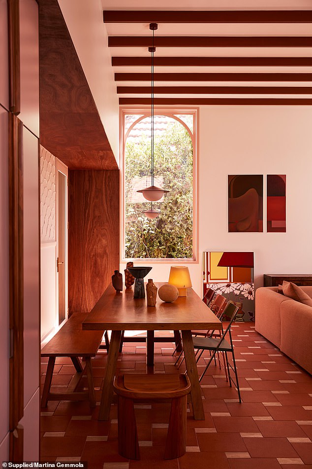
Discussing one of the most contentious trending colors for 2025, Andrea confirmed that rich red hues like burgundy and terracotta are making a significant comeback.
‘From living rooms to outdoor spaces, terracotta and burgundy bring richness and confidence. Its timeless appeal suits a wide range of architectural styles,’ she told FEMAIL.
She cited residential interior finalist project Claremont by WOWOWA Architecture in Melbourne for cleverly incorporating burgundy along with other warm earthy tones.

Rich red tones were incorporated in 2025 Dulux Colour Awards finalist project Claremont by WOWOWA Architecture

Rich red tones were incorporated in 2025 Dulux Colour Awards finalist project Claremont by WOWOWA Architecture

Trendy burgundy was seen throughout 2025 Dulux Colour Awards finalist project Lava Flow by Pac Studio
Andrea explained that the Spanish-style home featured ‘a romantic mix of pastels and rich burgundy to infuse the space with warmth and nostalgia, turning it into an intimate sanctuary’.
The Lava Flow by Pac Studio project in New Zealand was another great example of this hue being well used.
‘Volcanic reds throughout the home reflected the surrounding Auckland landscape,’ Andrea explained.
Joyful yellow
Yellow is the other surprising colour Andrea singled out as one to watch this year.
‘Yellow is making a joyful return, especially when paired with bold contrast colours,’ Andrea said.
However, she cautioned that the sunny hue is best used ‘sparingly’ as an accent to ‘add vibrancy without overpowering the space’.
A prime example was in New Zealand finalist Pac Studio’s Mt Eden Garden House project, which Andrea says utilised yellow in light wells and on walls to add an energising feel.

2025 Dulux Colour Awards finalist Pac Studio’s Mt Eden Garden House project used pops of energising yellow
Sage green
Sage green is also having an interior colour moment, with Andrea explaining it’s the perfect shade ‘for creating calm, harmonious spaces’.
Andrea points to Sydney project finalist Balmain East House by Studio Johnston as a prime example of the soft green hue being used to ‘bring calm to the kitchen and ground floor’ areas.

Sage green tones were featured in the kitchen area of 2025 Dulux Colour Awards finalist Stellar House by Robson Rak project
Misty blue
For those that are only prepared to dip their toe into the world of coloured interiors, Andrea suggests misty blue as the ideal entry point.
‘In the world of neutrals, ‘greige’ (a mix of grey and beige) paired with misty blues is one of the most powerful and peaceful combinations of the year.’
Finalists like Melbourne’s Stellar House by Robson Rak is a shining example of ‘how this colour combination works in harmony to create serene, sophisticated spaces’.

Stellar House by Robson Rak gently incorporated colour via misty blue elements
Colours to avoid
Although some homeowners may be wary of coloured interiors cheapening the overall look of a house, Andrea insists that this year’s trending shades can have the opposite effect when used with ‘subtlety and finesse’.
‘Colours like deep burgundy, rich sage green, and soft blues make a space feel sophisticated and luxurious,’ the interior expert explained.
However, Andrea concedes that not all colours ‘stand the test of time’ – and cautioned home renovators against using certain fast-ageing shades.
‘Bright, bold primary colours used in large doses can feel too intense and date quickly,’ she advised.
‘Flat, stark whites also fall into this category, as they can make a space feel cold and impersonal.
‘Instead, aim for softer, more refined shades that have a timeless quality and can adapt to changing trends.’